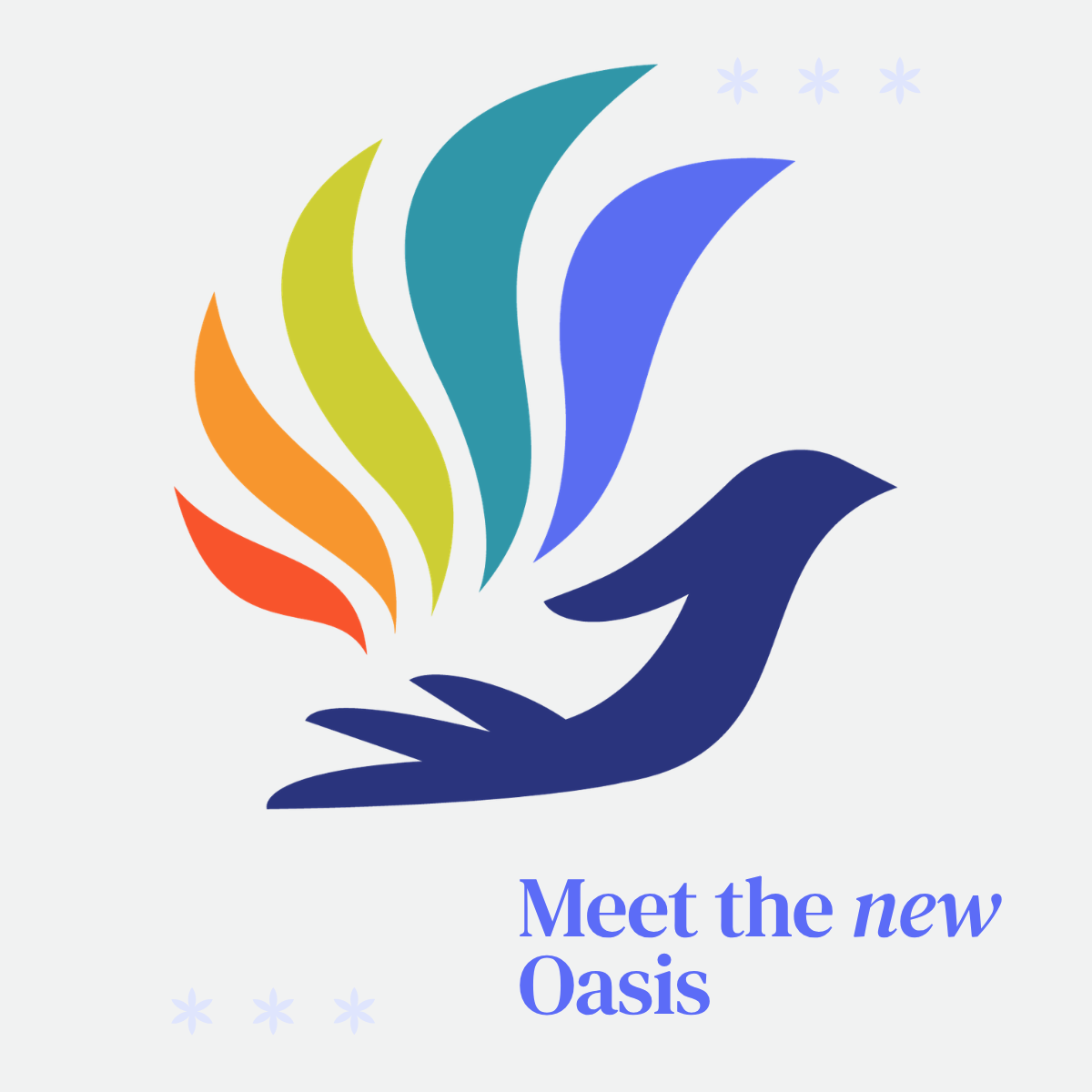
Meet the New Oasis 🌈
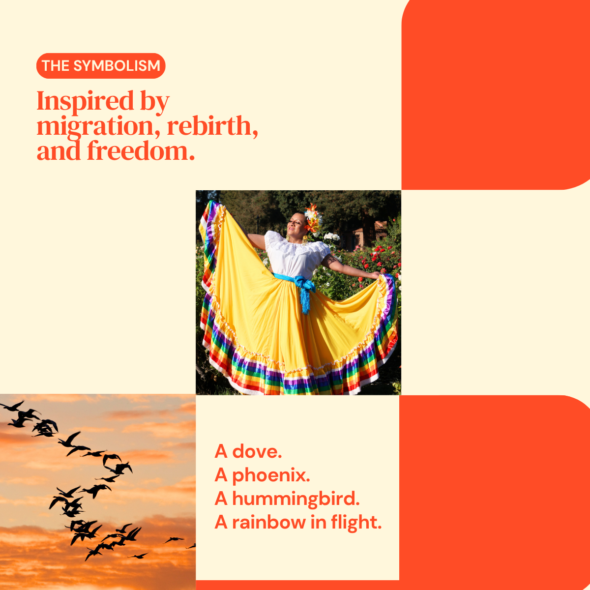
In 2017, Oasis was founded by four incredible women who believed in creating a safe space for LGBTQ+ immigrants. In doing so, they lovingly created a logo inspired by a fictional bird, such as a dove, a phoenix, and even a hummingbird.
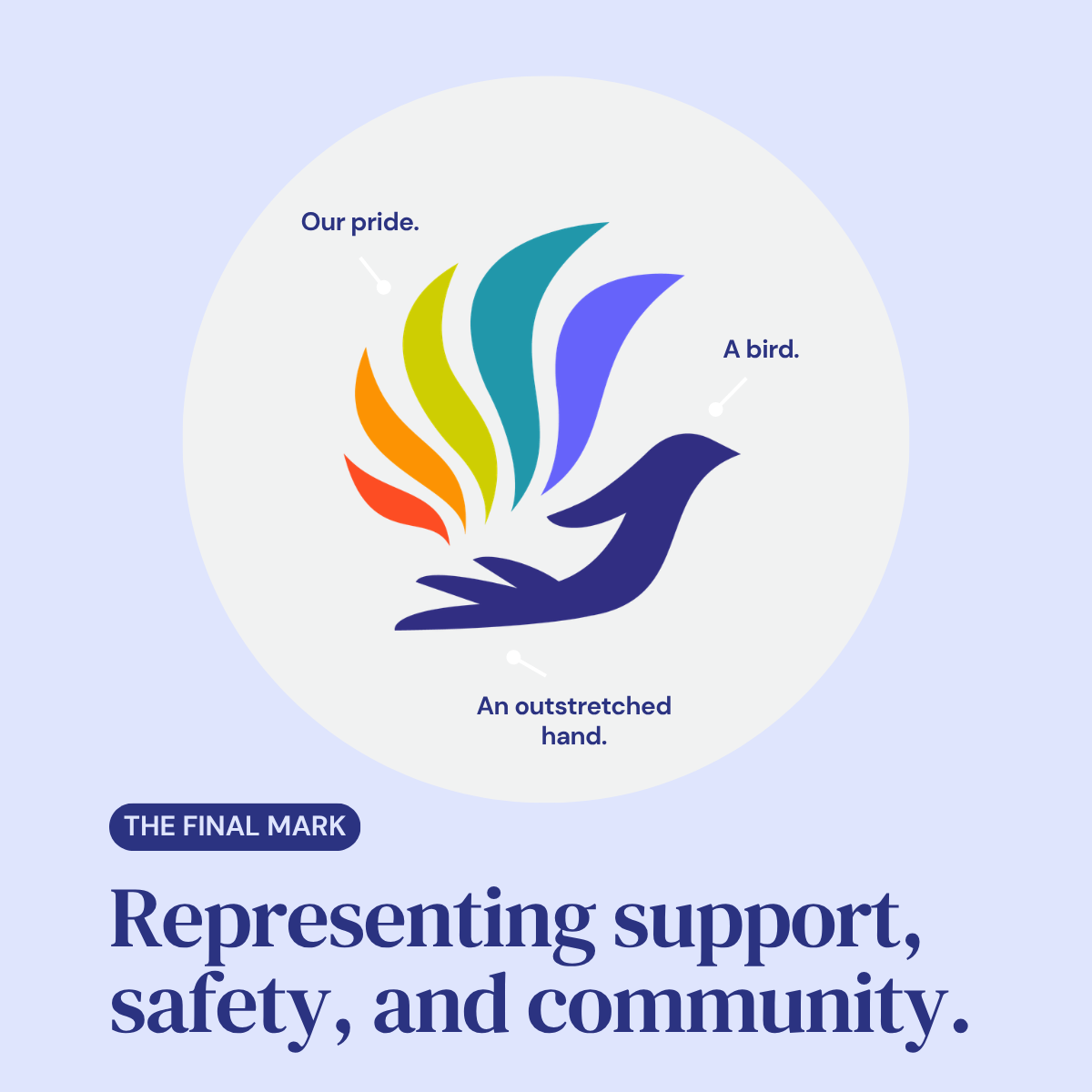
The Oasis bird has always represented migration, freedom of flight, and rebirth.
As Oasis grows, so does the story we tell. Even as we maintain the same spirit.
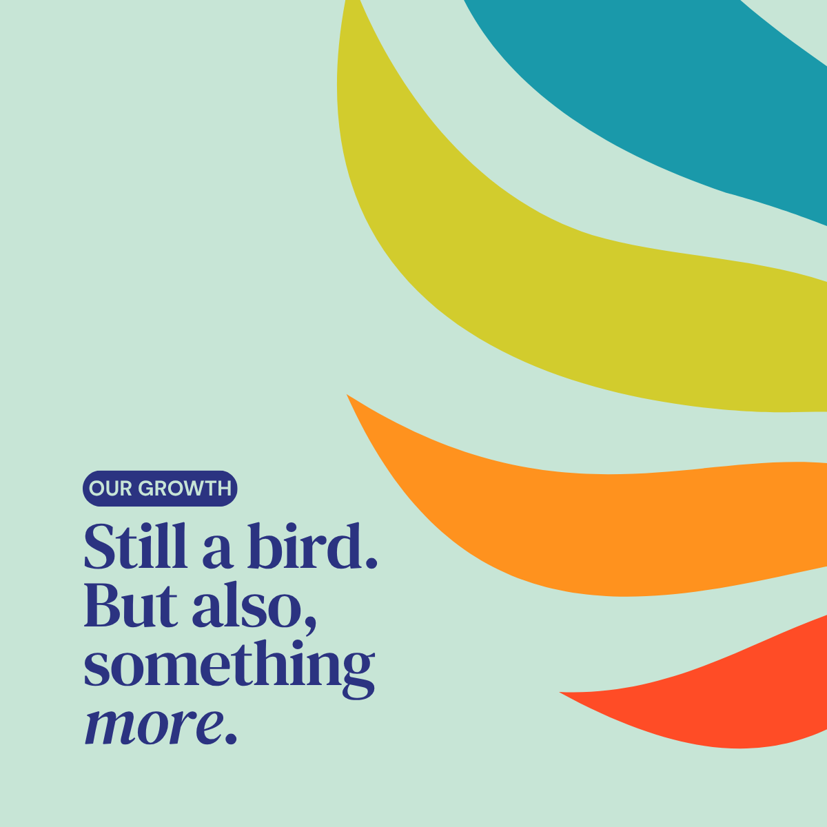
Our new logo is still a bird, continuing to honor journeys of migration, hope, and resilience.
But it is also an outstretched hand, offering warmth and safety, resources, and community. As our programs expand and our advocacy deepens, we’ve invested in a more comprehensive brand identity that reflects who we are today and where we’re going.
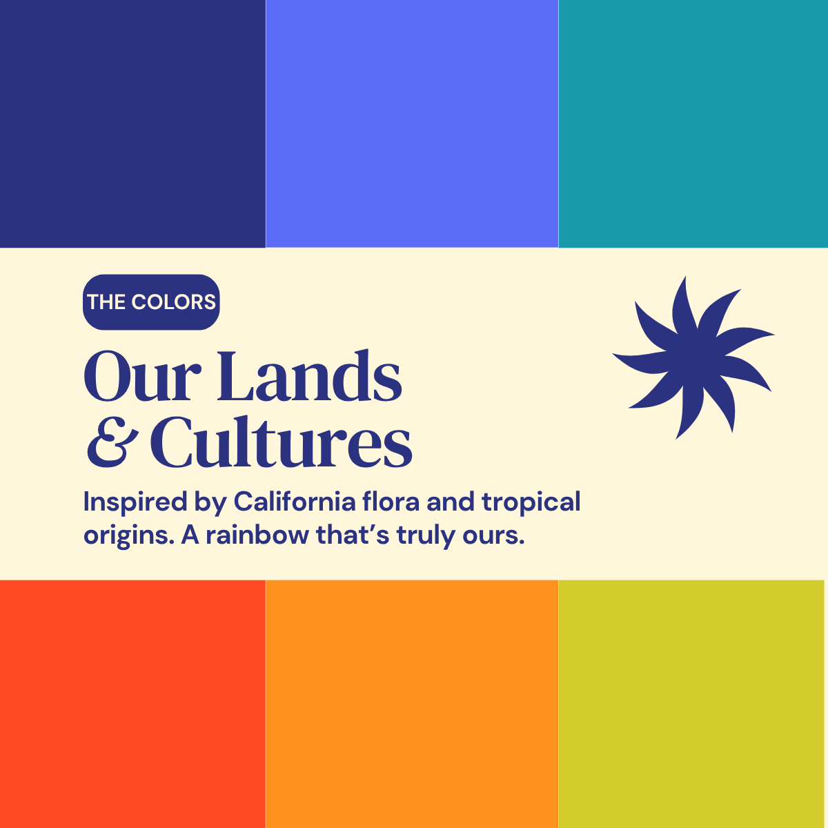
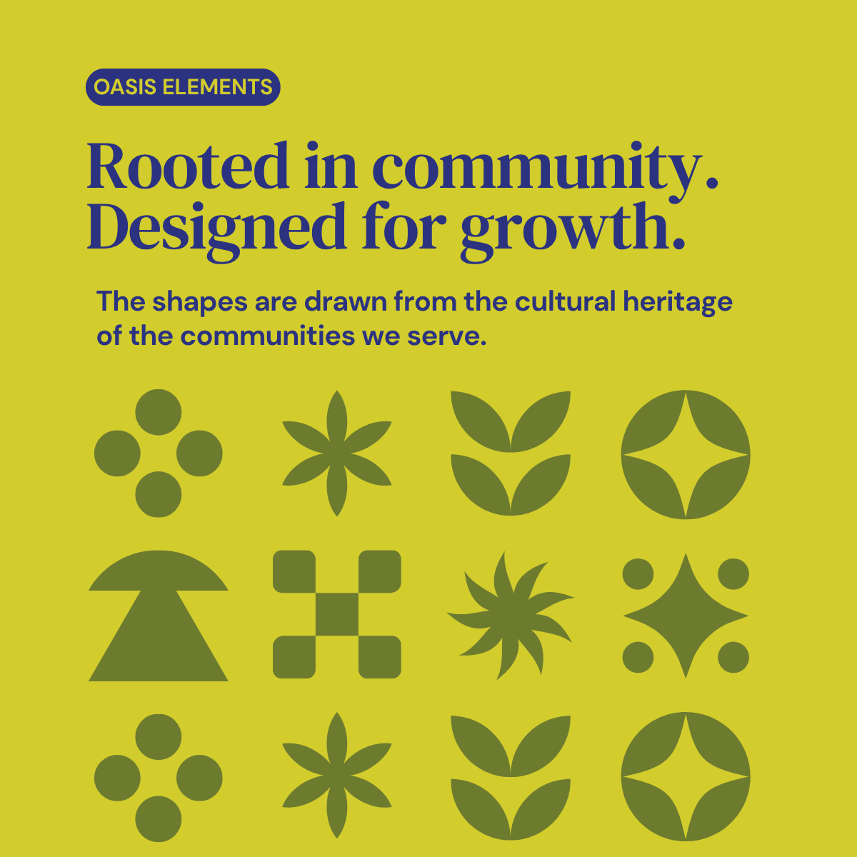
Our new brand takes inspiration from nature, queer identities, tropical and traditional influences. Reflecting the cultures and intersectionality of the communities we serve.
Queerness is still at the forefront.
Not only in color, but in our mission, the language we use, and the community we stand beside.
Thank you for standing with us as we embark on this new chapter.